GTSIGNS Rebrand
The opportunity
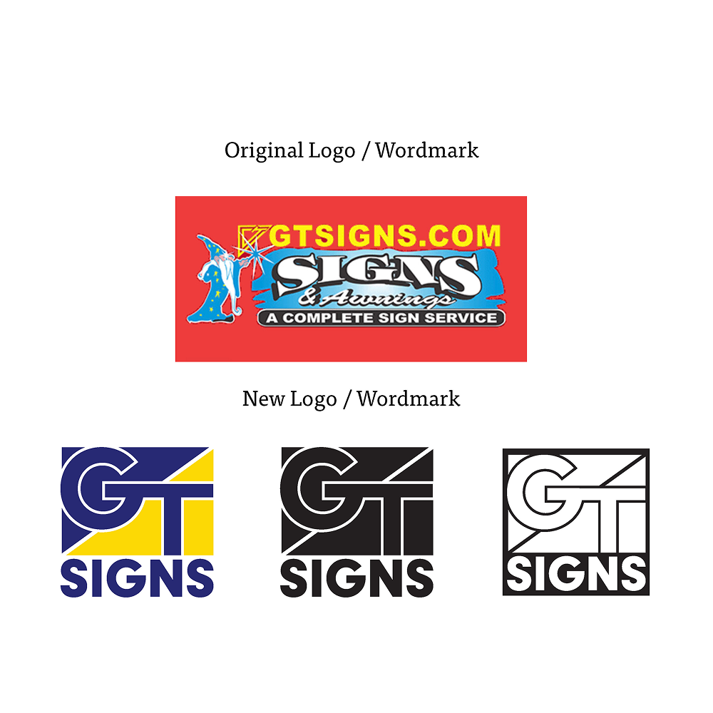
The idea was to take the existing brand of GTSIGNS, a rural company that specializes in signage, awnings, billboards and the likes. The rebrand was intended to capture the essence of this now over 50 year old brand, while giving it a modern and clean style.
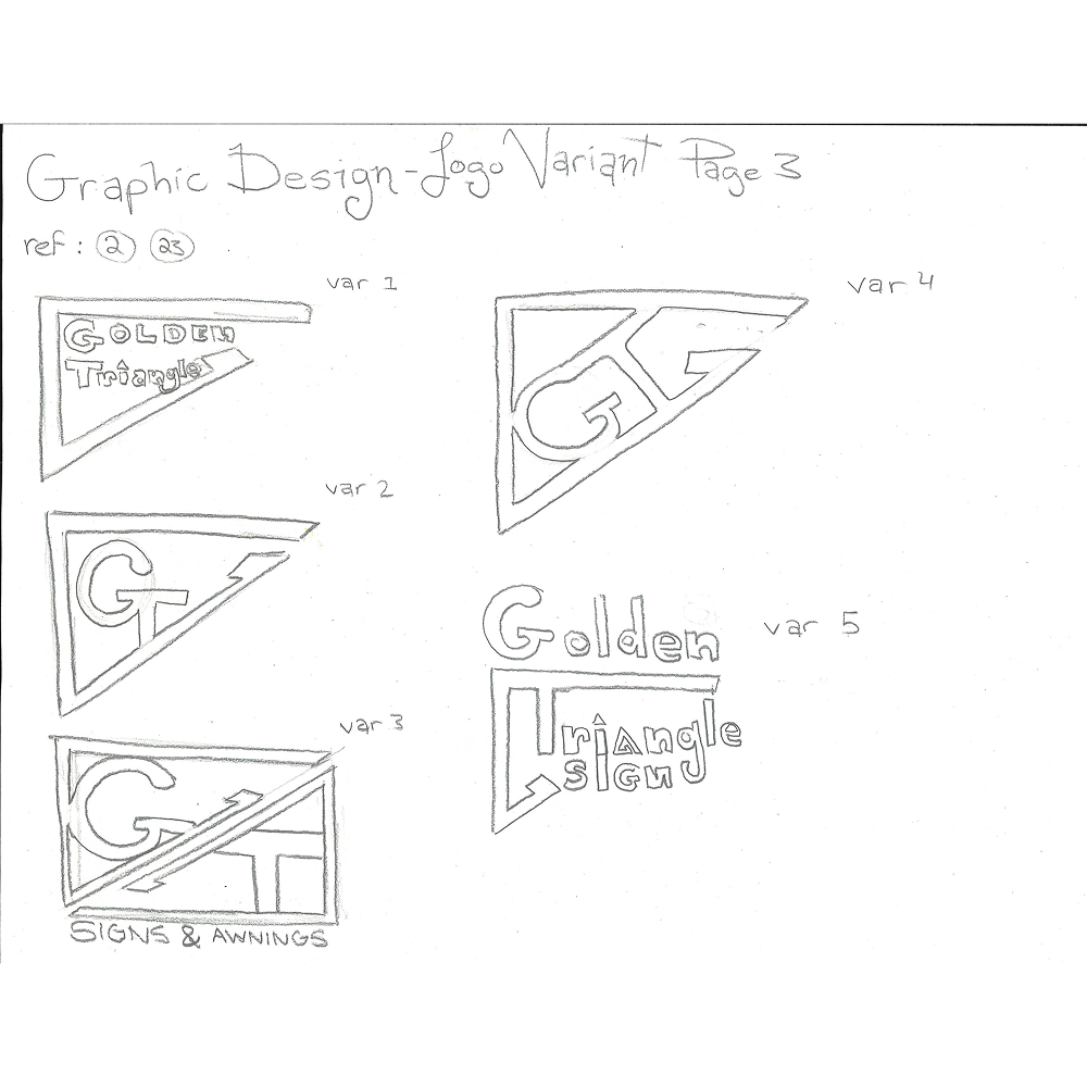
The original branding — and logo by extension — contained various font faces, colors, illustrative elements and services. This made the triage process quite substantial as figuring out what to cut and keep while preserving their historical image was quite challenging ; requiring quite a few revisions along the way.
The main goal was quite straightforward ; create a brand identity that not only looked professional and clean, but that also made sense to the context of the brand. For example, a minimalistic sleek modern design would have made no sense whatsoever, as the brand prides itself on its rural beginnings and community driven focus.
The Process
As it is a singular location rather than a franchise, the research began on their website, where research was conducted on their history, roots, early days and values. It was also important to learn more about the area of which it resides, as community influence plays a big part in its branding.
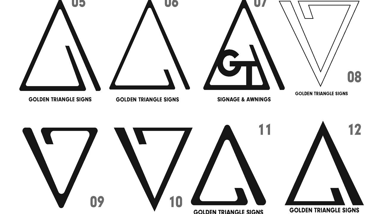
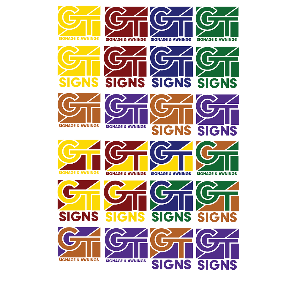
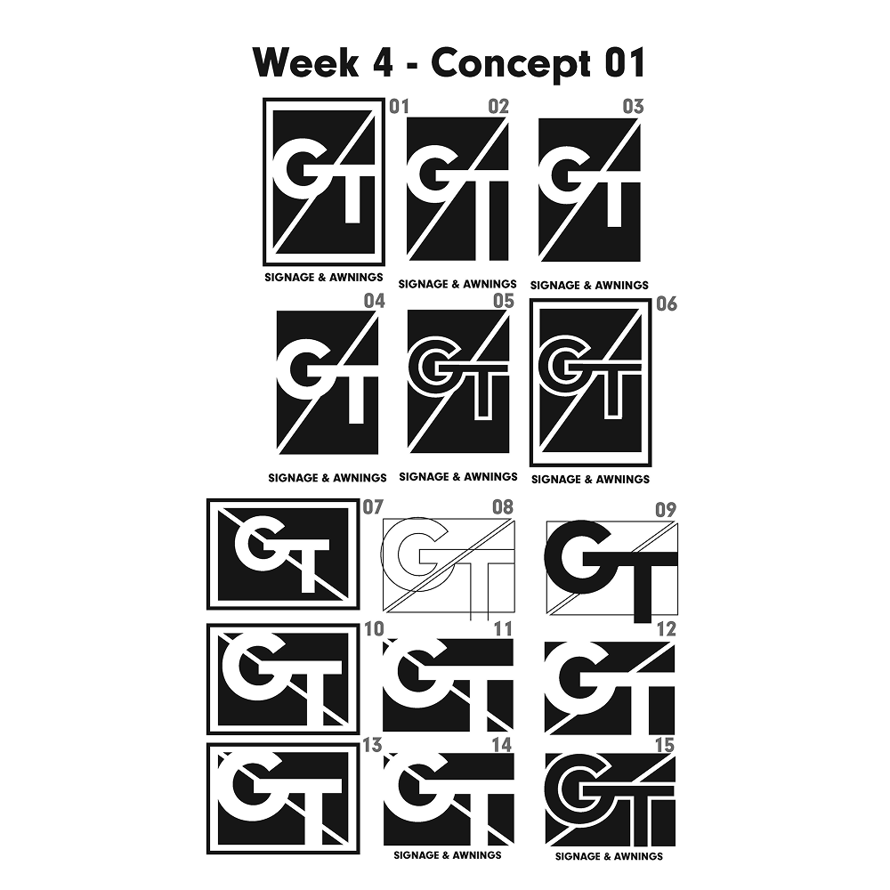
After many iterations, the final design utilized the bold, structural look of the original logo (top row), while using a visually interesting way to frame the final logo in its own “Signage”. The color choice had to the with the significance of blue, being trust, reliance and tradition, balanced with the yellow, that usually signifies expression, joy and creativity.
The outcome
With the 7 weeks provided, there was really no extra room to explore the brand, as the 60+ sketch variations, color explorations and digital reviews made it quite thoroughly polished. That said, If I were to start from scratch, I might find a new perspective otherwise missed.
With this project, I learned about my love and passion for branding, and my admiration from taking something existing, and breathing new life into it. This field may just be what I am looking for going forward.
Next Project
See more of my works below