Beer Can Design
The opportunity
The opportunity was straightforward: Create two cans for a new lines of beers at one of the vast local breweries here in Ottawa. While it important to keep to the essence of the company and their branding, we were also required to propose a design still far enough removed from the previous iterations to be truely called our own design.
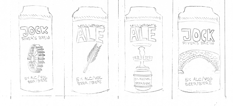
In my case, the selected brewing company was that of the Ashton Brewing Company, a local brewhouse in the small village of Ashton, attached to a traditional english pub with more than 180 years of history to boast.
.png)
What we did
To celebrate this longstanding history and local infamy of the pub, the two cans were designed to featured historical nods that tie the pub and brewhouse to its local village and nearby towns.
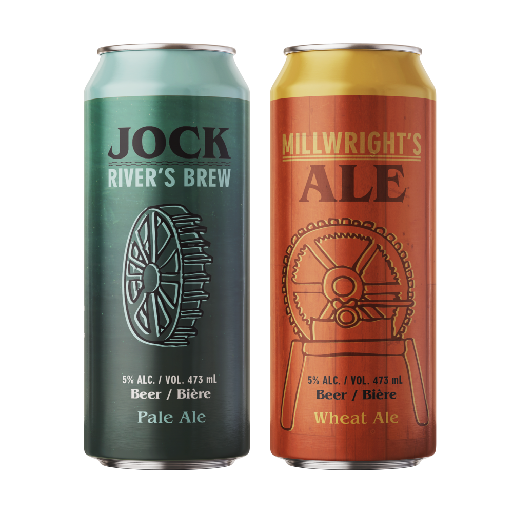
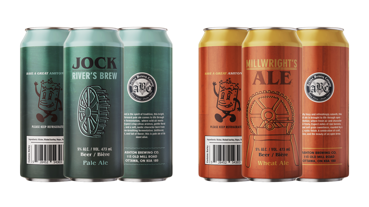
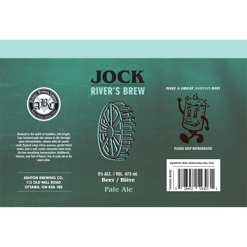
The first beer design, Jock River’s Brew, aims to celebrate the river found right below the pub, which served as a main source of water for the brewery for last two centuries. It is also a well know river in the area, bringing familiarity to locals, while giving intruige to newcomers.
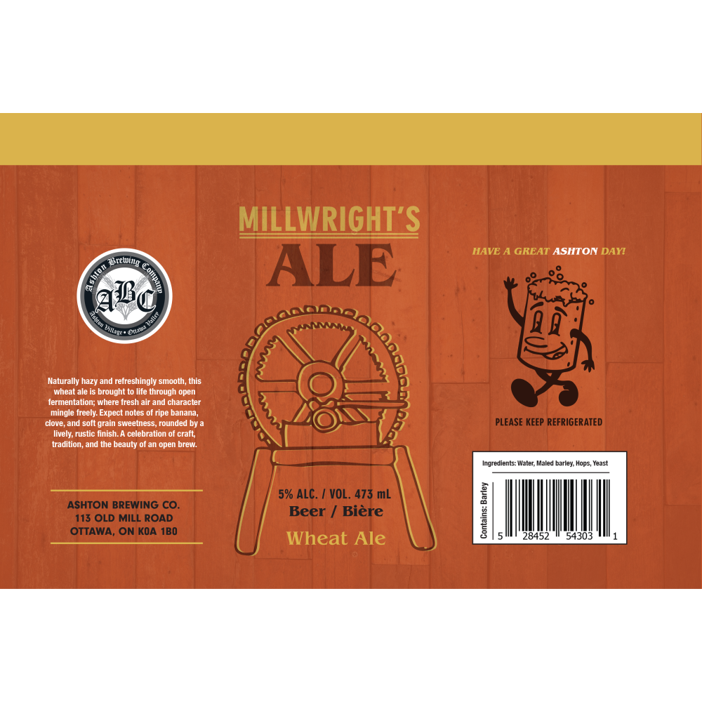
The second beer design, Millwright’s Ale, is moreso a historical nod to the longstanding history of the building, dating back to the 1800s when it was used as a simple mill. The idea is to create a facinating conversation starter regarding not only the now three generation buisiness that is the Ashton Pub, but moreover the significance of the town and its intruiging past.
The outcome
After multiple revisions and redesigns, these two cans were the final designs selected ; featuring a center stage illustration as a nod to each story, alongside a textured background and colored band on the top.
Looking back upon this project, I firmly believe I was able to create the best product I could within the given time frame, and could easily envision a full line released with this branding style.
The project also allowed to explore quite the design challenge, as this was my first real work in regards to can design. There are many and varied components to keep in mind alongside the face , curvature and overall workspace given when designing these, but it was a thrilling learning experience nevertheless.